Kick Ass with Sass
Who Are We
Lauren Byrwa
@labyrwa
Front End Developer at Palantir.net
Heather Rodriguez
@hrodrig
Web Developer at Rock Creek Strategic Marketing
Slides
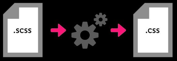
What is Sass?

Sass is CSS Extended
Sass is a lean, clean CSS extension language:
You write Sass; your browser sees CSS.
What you write
$bold: 700;
$link-color: #33CCFF;
$sans-serif: 'Arial, Helvetica, sans-serif';

body {
  font-family: $sans-serif;
  a {
    font-weight: $bold;
    color: $link-color;
  }
  ul {
    list-style-type: none;
  }
}
What the browser sees
body {
  font-family: "Arial, Helvetica, sans-serif";
}
body a {
  font-weight: 700;
  color: #33ccff;
}
body ul {
  list-style-type: none;
}
Sass Facts
- Sass is implemented through a Ruby gem
- Stands for "Syntactically Awesome Stylesheets"
- Designed by Hampton Catlin and developed by Natalie Weizenbaum in 2007
- The most widely used CSS preprocessor within our community
Why Sass?
The problem with CSS
- Repetitive and messy
- Bad coupling (especially in Drupal)
- Bloated code
- Difficult to maintain
- Bad for performance

Fight back with Sass!
Benefits of using Sass
- Write fewer lines of code with less repetition (stay DRY!)
- Change values in one place; watch them update everywhere!
- Spend less time in development
- Improve site performance
- Organize files for better maintainability
- Use cool features such as functions and mixins absent from CSS
#winning

Features
Variables
Variables store small pieces of information for reuse throughout your stylesheets.
- Colors
- Font stacks
- Breakpoints
- Common font sizes
$variable-name: code;
// Fonts
$nimbus-sans:     "nimbus-sans", Times, serif;
$bold:           500;
$normal:         400;
$light:          300;
// Colors
$highlight-color: #ffca0a;
$link-color: #ff0000;
$black: #000000;
$white: #ffffff;
$charcoal: darken($white, 70);
SCSS
// Fonts
$nimbus-sans:     "nimbus-sans", Times, serif;
$highlight-color: #ffca0a;
$bold:           500;
blockquote{
  font-family: $nimbus-sans;
  color: $highlight-color;
  font-weight: $bold;
}
CSS
// Colors
blockquote{
  font-family: "nimbus-sans", Times, serif;
  color: #ffca0a;
  font-weight: 500;
}
Operators
Math is hard. Let Sass take care of the work.
SCSS
.container{
  width: 100%;
}

article[role=”main”]{
  float: left;
  width: 600px / 960px * 100%;
}

aside[role=”complimentary”]{
  float: right;
  width: 300px / 960px * 100%;
}
CSS
.container{
  width: 100%;
}

article[role=”main”]{
  float: left;
  width: 62.5%;
}

aside[role=”complimentary”]{
  float: left;
  width: 31.25%;
}
Nesting
Visual hierarchy makes it easy to understand and organize selector relationships.
SCSS
.breadcrumb {
  font-size: .8em;
  margin-bottom: 2rem;
  li {
    display: inline;
    list-style-type: none;
    margin: 0;
    padding: 0;
  }
  a{
    color: $mirage;
  }
}
CSS
.breadcrumb {
  font-size: .8em;
  margin-bottom: 2rem;
}
.breadcrumb li {
  display: inline;
  list-style-type: none;
  margin: 0;
  padding: 0;
}
.breadcrumb a{
  color: $mirage;
}

Nest Sparingly and avoid overly specific code
Ampersand (&)
Use to merge two selectors, either preceding or following an element.
Use Cases:
- Pseudo elements
- Hover and focus states
- Modernizr, HTML5 Boilerplate, Google Webfont loader classes
Preceeding Ampersand (&)
SCSS
.menu a{
color: $crimson;
  &:hover{
    color: $white;
  }
}
CSS
.menu a{
  color: #ed1c24;
}
.menu a:hover{
  color: #ffffff;
}
Trailing Ampersand (&)
SCSS
.accordion__header{
  margin: 0;
  background: url(../images/retina/accordion-down.png) no-repeat;
  background-size: 13px;
  .lt-ie9 &{
    background: url(../images/ie/accordion-down.png) no-repeat;
  }
}
CSS
.accordion__header {
  margin: 0;
  background: url(../images/retina/accordion-down.png) no-repeat;
  background-size: 13px;
}
.lt-ie9 .accordion__header {
  background: url(../images/ie/accordion-down.png) no-repeat;
}
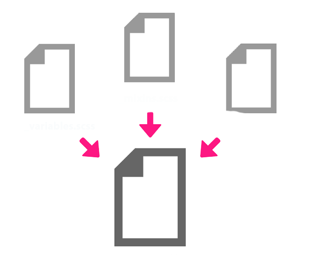
Partials
Split your CSS into smaller, more maintainable snippets
Partials are NOT standalone CSS files
_filename.scss
_alerts.scss
_buttons.scss
_checkboxes.scss
_footer.scss
_forms.scss
_icons.scss
_menus.scss
_messages.scss
_throbbers.scss
_typography.scss
Import
- Use @import to combine partials into one file
- One HTTP request per non-partial file
- CSS uses @import but creates many HTTP requests
@import "base";
@import "reset";
@import "layouts/responsive";
@import "components/header";
@import "components/navigation";
@import "components/messages";
@import "components/tabs";
@import "components/morelinks";
@import "components/blocks";
@import "components/unpublished";
@import "print";
Mixins

- Groupings of CSS declarations you define once and reuse throughout website
- Can include variables
- Use cases:
- retina sprites
- clearfix
- breakpoints
- CSS3/Vendor prefixes
Mixin
@mixin border-radius($radius) {
  -webkit-border-radius: $radius;
     -moz-border-radius: $radius;
      -ms-border-radius: $radius;
          border-radius: $radius;
}
SCSS
.hover-content--featured{
  @include border-radius(10px);
  background: $viking;
  font-size: 1.333333333rem;
  font-weight: $semibold;
  height: 100%;
}
CSS
.hover-content--featured{
  -webkit-border-radius: 10px;
  -moz-border-radius: 10px;
  -ms-border-radius: 10px;
  border-radius: 10px;
  background: $viking;
  font-size: 1.333333333rem;
  font-weight: $semibold;
  height: 100%;
}
Extend/Inheritance
Using @extend lets you share CSS properties from one selector to another.
It really helps keep your CSS DRY.
SCSS
.btn{
  background: $whitesmoke;
  color: $mirage;
  padding: .6rem .8rem;
  padding-right: 2.666666667rem;
}

.btn--expand{
  @extend .btn;
  background: $crimson;
  padding-right: 2.133333333rem;
}
CSS
.btn,
.btn--expand{
  background: $whitesmoke;
  color: $mirage;
  padding: .6rem .8rem;
  padding-right: 2.666666667rem;
}

.btn--expand{
  background: $crimson;
  padding-right: 2.133333333rem;
}
When do you use a @mixin vs @extend?
@mixin repeats the code every time and the CSS gets bloated
@extend will add the selectors together and then output the code just once
Mixin - SCSS
@mixin element-invisible{
    position: absolute;
    height: 1px;
    width: 1px;
    overflow: hidden;
    }

    .foo{
    @include element-invisible;
    }

    .bar{
    @include element-invisible;
    }
Mixin - CSS
.foo{
    position: absolute !important;
    height: 1px;
    width: 1px;
    overflow: hidden;
    }

    .bar{
    position: absolute !important;
    height: 1px;
    width: 1px;
    overflow: hidden;
    }
Extend - SCSS
.element-invisible{
position: absolute !important;
height: 1px;
width: 1px;
overflow: hidden;
}

.foo{
@extend element-invisible;
}

.bar{
@extend element-invisible;
}
Extend - CSS
.element-invisible,
.foo,
.bar{
  position: absolute !important;
  height: 1px;
  width: 1px;
  overflow: hidden;
}
So really, when do you use @mixin vs @extend?
ANSWER:
%placeholder with @extend
Placeholder
Using placeholder (%) with @extend lets you combine the selectors
No worries about unused selectors
SCSS
%element-invisible{
  position: absolute !important;
  height: 1px;
  width: 1px;
  overflow: hidden;
}

.foo{
  @extend element-invisible;
}

.bar{
  @extend element-invisible;
}
CSS
.foo,
.bar{
  position: absolute !important;
  height: 1px;
  width: 1px;
  overflow: hidden;
}
So when do you use each?
Mixin:
When you use a variable or the output changes
Extend:
when you’re using the original selector already
Placeholder:
when the code is always the same
when you don’t need the original selector
Drupal and Sass
Base themes that support Sass:
- Zen 5
- Omega 4
- Aurora
- Adaptive Theme
- and others…
Getting Started
Install Ruby
- Macs already come with Ruby (win for us!)
- Download Ruby for PC
Open Terminal and run a short command
gem install sassYAY! YOU’VE INSTALLED SASS
Compiling your Sass
Sass can compile itself
sass --watch path/sass-directorySo can libraries such as Compass or Bourbon, which can also add much more functionality
gem install compass
compass watch
compass compile
If you're using a task runner like Gulp and Grunt, that will compile too.
Not a Terminal fan? Try Scout or CodeKit
Sass Challenges
Nesting: can get crazy long and over specific
Versioning: Bundler to keep team members on same gem
Keep output in mind: Using @import to separate out files requires a logical structure
If you write bad CSS, you will write bad Sass
More stuff to Sass out About
Data type: a way of classifying a piece of information. Common examples in programming are booleans, strings and integers
Control structure: instruction to the computer on how to evaluate a piece of data.
Data Types & Control Structures
Data Types
- Numbers
- Strings
- Colors
- Booleans
- Null
- Lists
- Maps
Control Structures
- @while
- @for
- @if/@elseif/@else
- @each
Lists and Maps
Lists = arrays
Maps = hashes
$social: (
    "facebook":       '\f204',
    "twitter":        '\f202',
    "linkedin":       '\f207',
    "pinterest":      '\f209',
    "github":         '\f200',
    "dribbble":       '\f201',
    "instagram":      '\f215',
    "email":          '\f410'
  );
And can also be multidimensional
$mega-social: (
    "facebook":   ( content: "\f204", coords: 0 0 ),
    "twitter":    ( content: "\f202", coords: 0 -64px ),
    "linkedin":   ( content: "\f207", coords: 0 -128px )
  );
@each
Mixin
@each $network, $content in $social {
  .#{$network} a:before {
    content: $content;
  }
}
CSS
.facebook a:before {
  content: '\f204';
}

.twitter a:before {
  content: '\f202';
}

.linkedin a:before {
  content: '\f207';
}

...
Resources to learn more
- Sass Documentation (Data Types)
- Sass Maps Are Awesome! - Viget
- Maptastic Maple - The Sass Way
- Sass Documentation (Control Directives & Expressions)
- Sass control directives - The Sass Way
- The Future of Sass - David Walsh